Let’s start with that iconic Peters Fans advertising ad film screening sequence shown in the feature film Seemabaddha directed by the master. (If you still haven’t watched this film, you should, before you read this any further!)
If you watch the minute detailing prevalent in that scene, you can understand it can only be portrayed with such vivid advertising-world vibes only if the director has experienced or been a part of the trade.
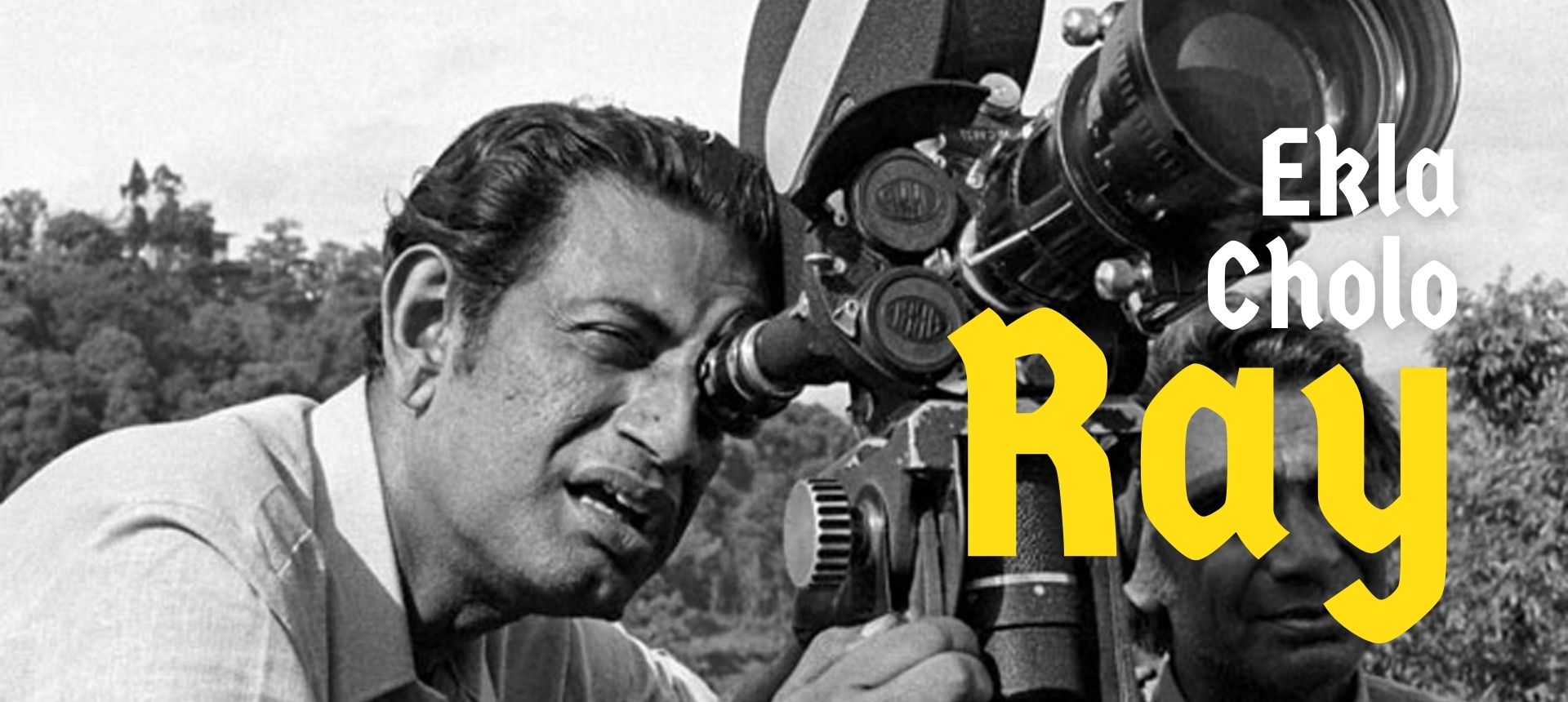
Ray was a very honest filmmaker. None of his films were ever made with artificial intelligence. Well, this is not a dig at the generation we are living in. The digital diaspora was evidently missing then.
These were pre-digital times, so every artwork had to be done by hand, judged by the eye, and measured to scale. “When he would make 30×40-inch posters, he would find a board of the exact size and gum the sides of a sheet of paper so it stuck to the board and remained stable through the sketching process,” says Sandip Ray,—about his perfectionism. “He would then use an amalgamation of photography and sketches, pasting images together and creating collages, while painting the other details.” (quoted from an article on Ray where Sandip was interviewed)
It was April of 1943, when Satyajit Ray joined a British advertising agency called D. J. Keymar as a Junior Visualiser. He spent the next 13 years in this agency until he became a feature filmmaker post the success of his cult classic “Pather Panchali”. When he wanted to make this feature, his agency gave him a full paid leave and expected him to come back. It’s probably the “Prix du document humain” prize at Cannes, that prevented him from getting back into advertising.
He was a master hand at illustrations and executed some brilliant campaigns. He became such a stalwart as a revolutionary filmmaker, that his repute shrouded his graphic design and illustration acumen. His oeuvre as a graphic artist is as rich and diverse as his filmography, but.
Ray studied under the tutelage of stalwarts like Nandalal Bose and Benod Behari Mukherjee, whose profound influence would reflect on his body of work throughout his lifetime. He learned the art of breaking rules from them by staying close to his heritage. Being born into a family of writers, poets and illustrators, Ray got a degree in Economics from Presidency College before moving to Shantiniketan to study painting at the Kala Bhavana at Visva Bharati University; Ray was indeed lucky to be surrounded with everything that could have made the Satyajit out of him.
In his advertising agency, he cracked and designed witty campaigns for biscuits, hair oils and cigarettes, and also designed book covers and jackets. His then-unique style shrugged off the colonial hangover, and Indianized publication design and advertisements in a way Indian audiences had never seen before. In 1950, D.J. Keymer sent Ray to London to work at the agency’s headquarters, an opportunity that introduced him to world cinema. In just three months, he watched 99 movies and penned the script for Pather Panchali while at sea, on his way back to India. However, his preparation for filmmaking was in the form of his more familiar medium of illustration. “My earliest memories of my father are of him working in his study at home, storyboarding his films. He would always sketch every scene by hand to visualize it in his mind first; storyboarding for him was a revered ritual,” says Ray’s son, filmmaker Sandip Ray. “From his very first film, he took charge of the creative direction for the graphic collateral, like posters and flyers. I remember him holed up in his study, illustrating, colouring, and splicing images together until the artworks were ready for printing.” (quoted from an article on Ray where Sandip was interviewed)
If you take a look at the film posters he designed, it carries an essence of his rebellious artistic fervour which challenged the existing norms of designing. He introduced photography to graphic art and was a master at mixed media art forms. His deep interest in photojournalism and his extensive study of the work of Henri Cartier-Bresson, reflects in all poster designs he created for his films.
A master calligrapher, Ray had a profound love for typography, and two of his typefaces, Ray Roman and Ray Bizarre, won a 1971 international typography competition. His nuanced understanding of expressive typography is reflected in the poster for the cult film in the Kolkata trilogy called “Mahanagar”.
It is true that advertising creatives around the world have always denounced their profession and often lamented being in the trade for long. But it is Ray who learnt every trick of the game from this advertising world. He has never repented a single day spent in the agency. I had the privilege to work in the same advertising office where Ray had worked. In my time, it became Clarion. I have often walked the corridors where Ray had spent his days thinking of an ad campaign. I have sat where he used to sit and think. Believe me, it still gives me goosebumps.
Considering the artistic journey he took, challenging and breaking the norms, reinventing the rules of the game and walking the path all by himself, dedicating Tagore’s “Jodi tor daak shune keu na ashe” to this enigmatic journey sounds quite apt to me.
Oh, you still haven’t seen the Peters Fans ad sequence in Seemabaddha?
ArrRAY!!!!